Tea & Glory
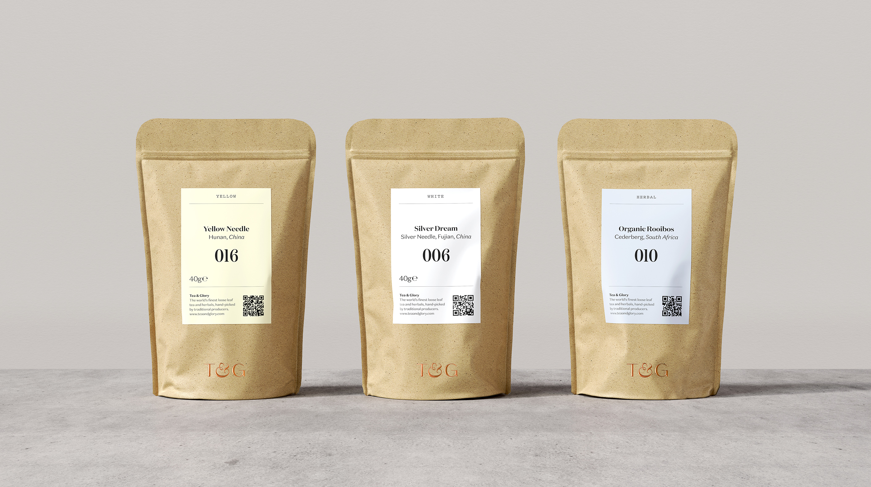
Premium loose-leaf tea experts Tea and Glory approached us to create a brand identity, packaging system and interior signage to reflect their positioning as the antithesis of fast-paced coffee culture. Their mission is to encourage the world to slow down and enjoy the ancient ritual of brewing and drinking tea.
The tone of the brand is appropriately contemplative, with subtle details that convey meaning: The ampersand of our custom logotype and monogram references a steaming cup. Tonal colour indicates variety. Our pattern system represents the balance of elemental factors – water, soil, growing region and altitude – so important to the teas hand-selected by founder Andy Perryman.


Latest projects


