Tenzing Skincare
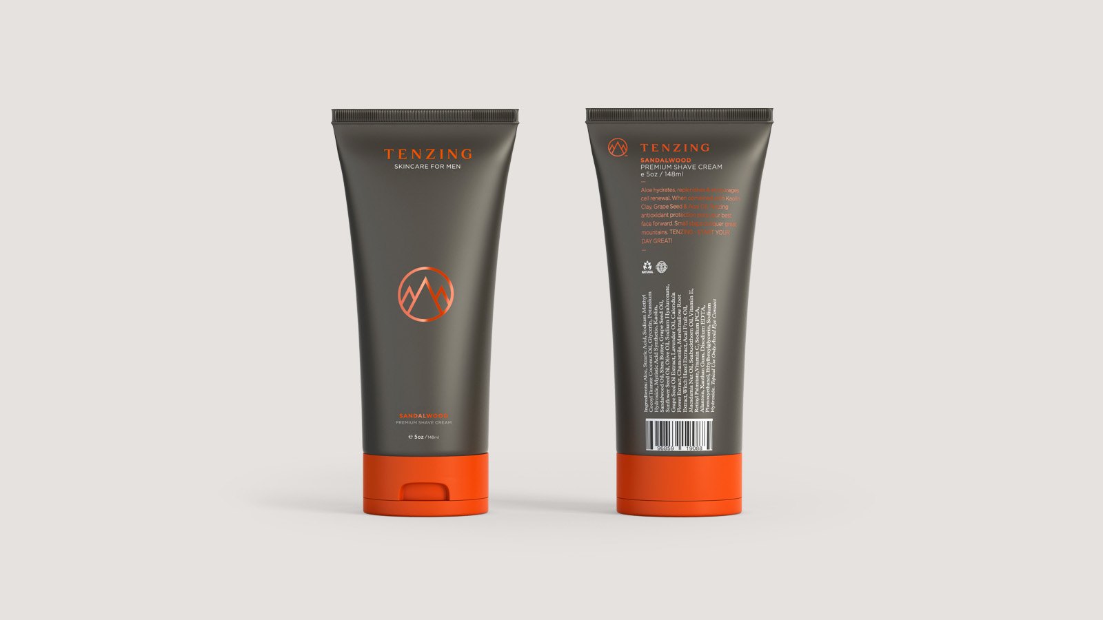
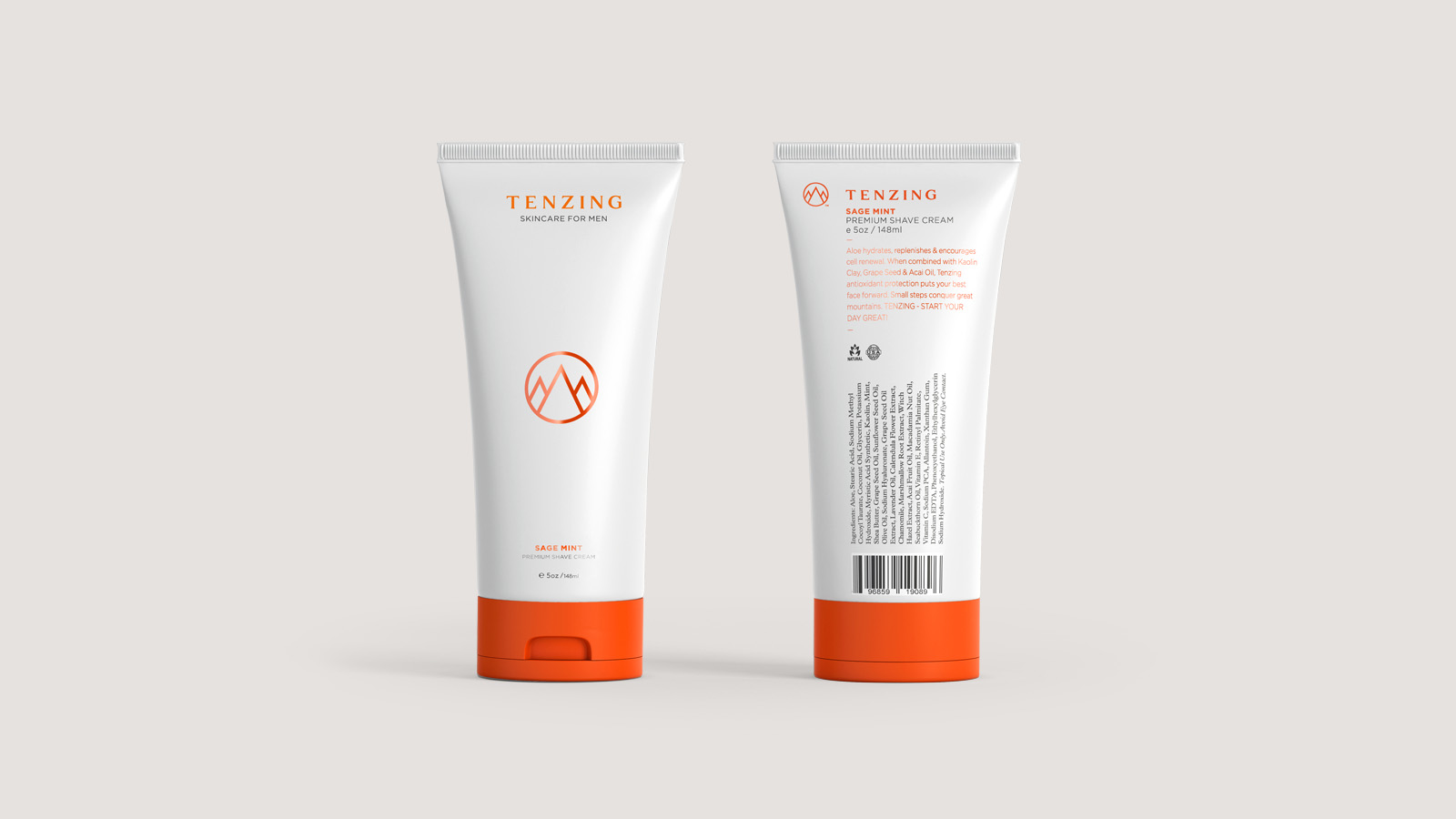
Tenzing is a men’s skincare brand named after Sherpa Tenzing Norgay, part of the first two-man team that climbed Mt Everest more than 60 years ago. Tenzing differentiate from competitor brands through their range of aloe based products that combine some of the healthiest and most natural ingredients known to man. These ingredients are sourced exclusively from the U.S and include key age defying anti-oxidants that are found in grapeseed oil, acai berry and vitamin A.
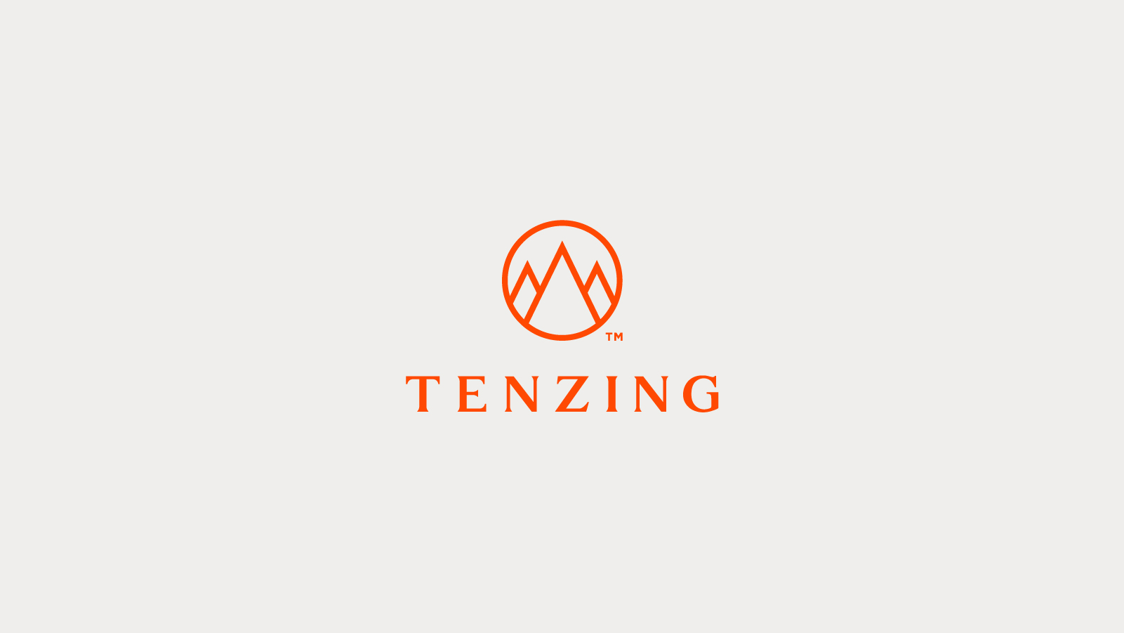
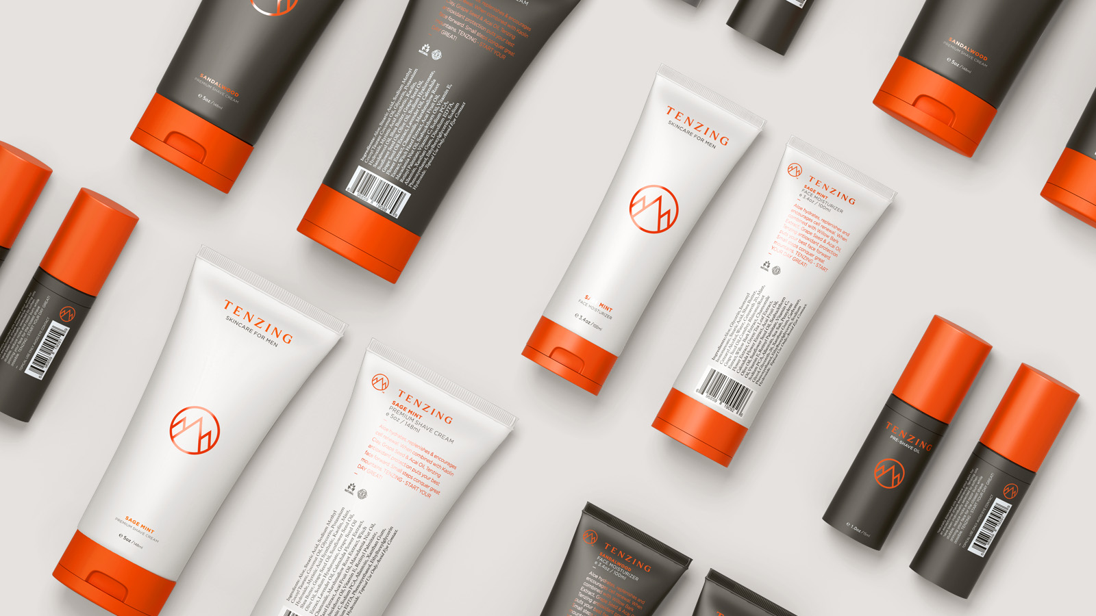
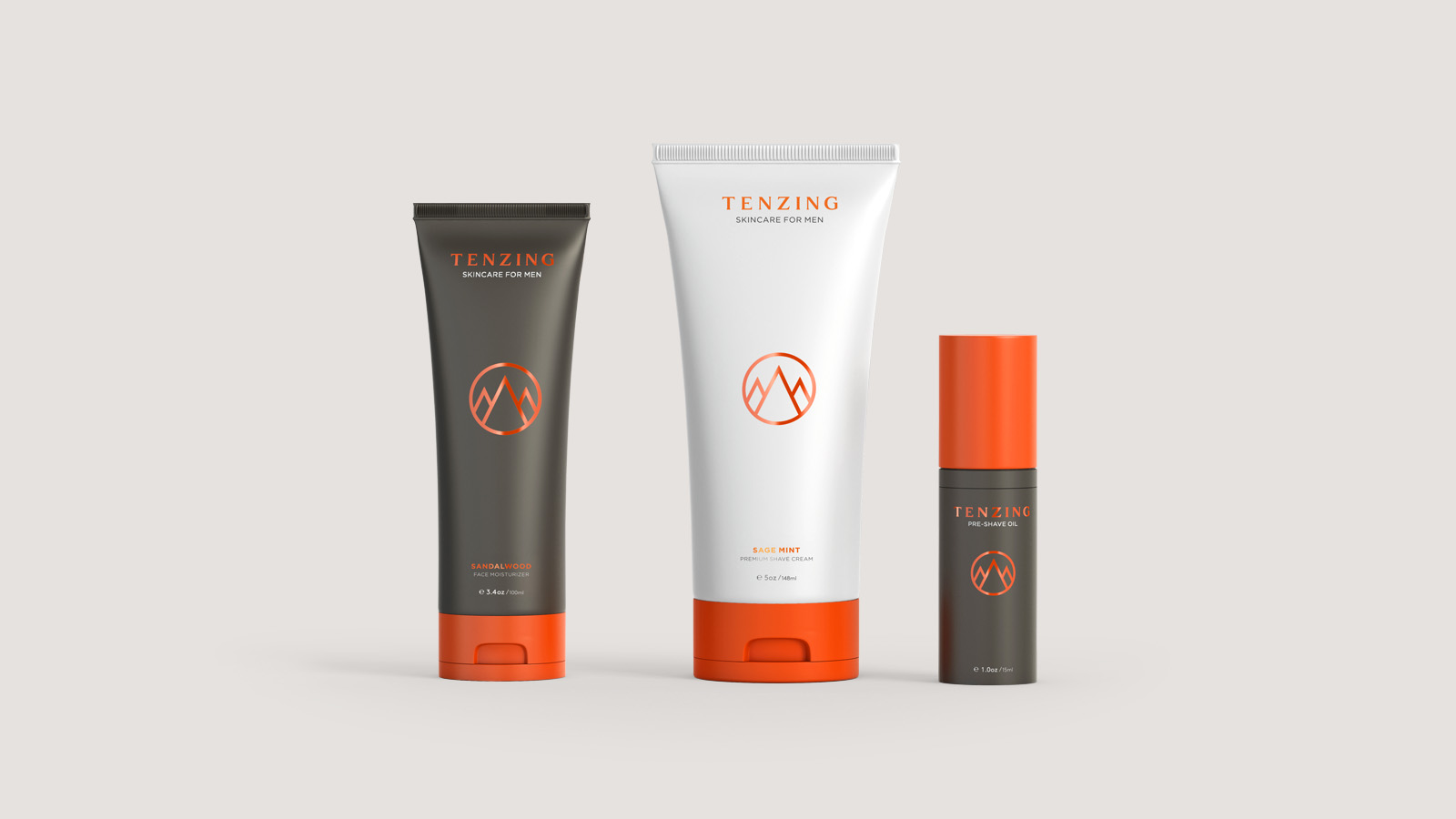
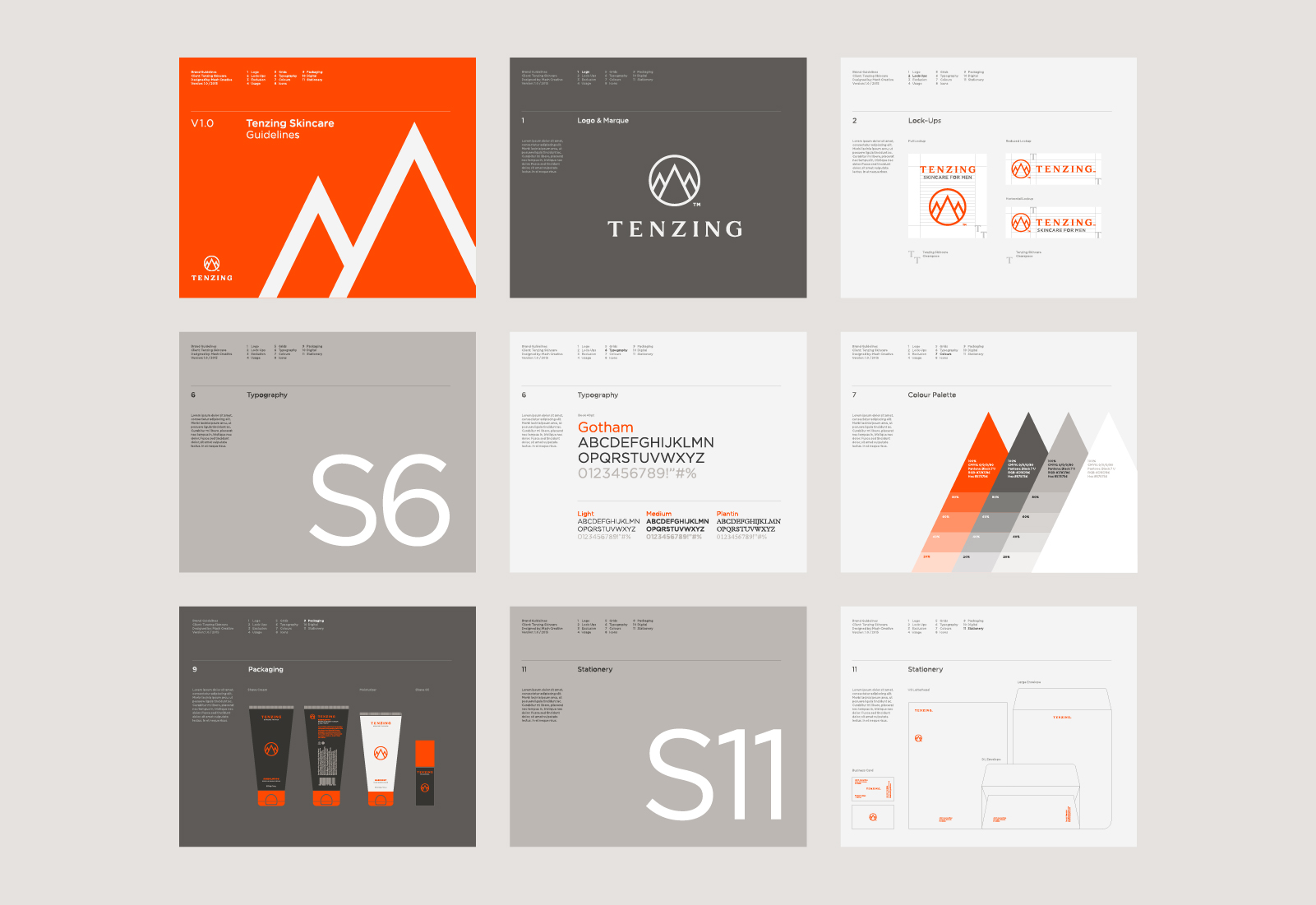
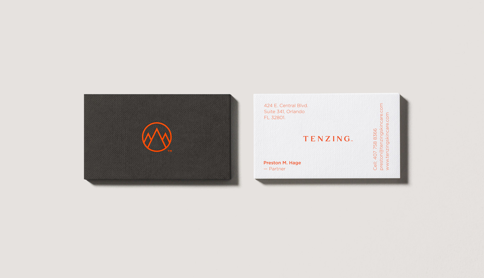
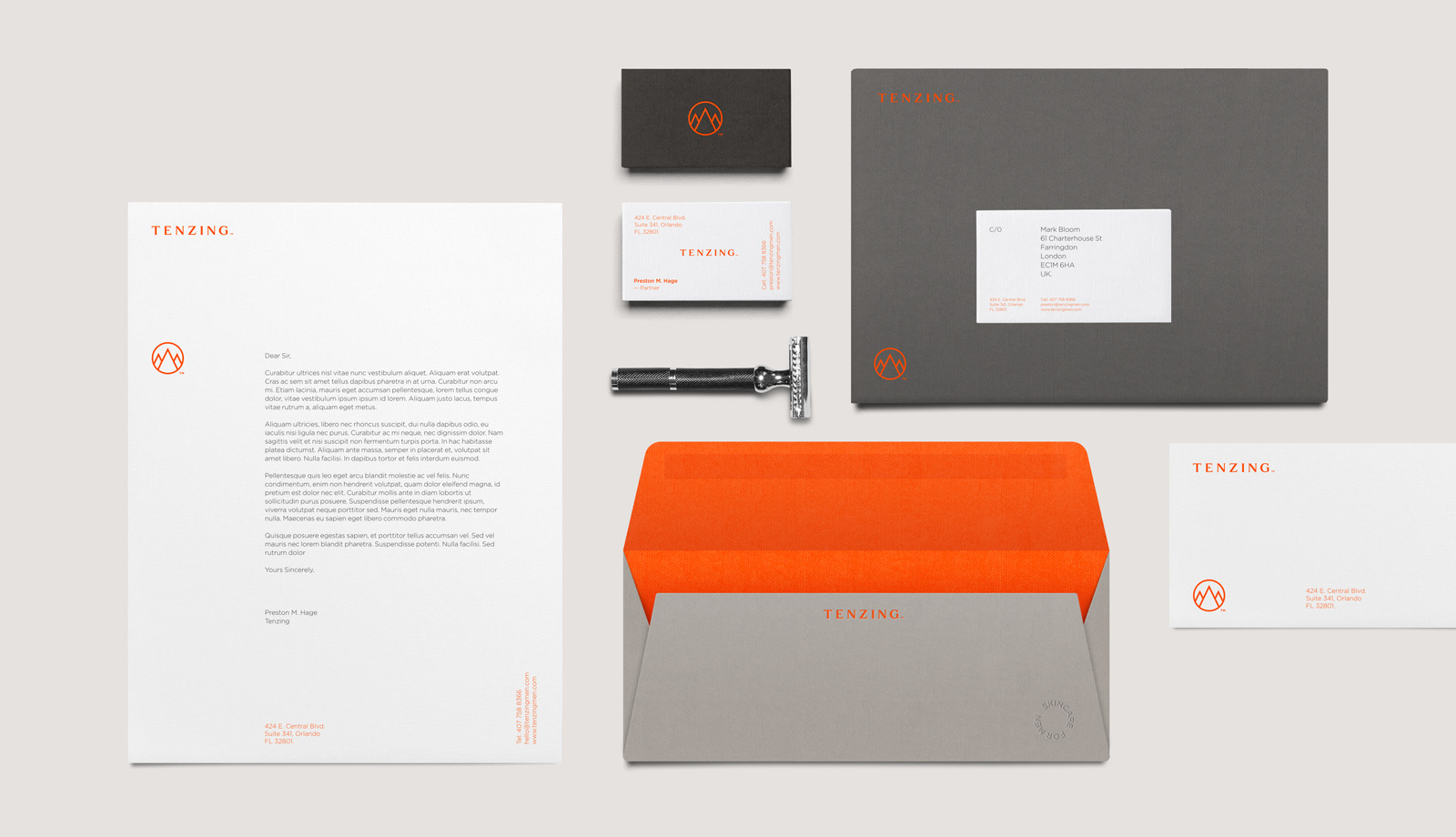
Working in collaboration with Mash Creative, Socio designed a brand and packaging system for the first release of Tenzing products. The new brand featured an iconic mountain marque designed to lead the storytelling of Sherpa Tenzing Norgay and act as a metaphor for ‘conquering life’. The geometry and cleanliness of the marque was offset with a robust serif logotype, helping to communicate the historical background of Tenzing Norgay and position the products for a male audience.
A vibrant orange was selected as the main brand colour for packaging and POS as it gave the product increased visibility in a retail environment whilst also communicating the refreshment that comes from the aloe based products. Sage Mint and Sandalwood variations were differentiated through a suite of warm greys, designed to work alongside the primary brand colour as well as looking noticeably different. The range of skincare products is available to buy on the Tenzing skincare website.

Related projects